by Daniel Dunne
Dark Mode for Android and iOS is a popular setting for many smartphone and tablet users across the globe regardless of the user’s level of vision. The benefits of Dark Mode not only make it easier for some visually impaired users to navigate and use their device but also serve as an important energy-saving measure for your device.
Dark Mode is a beneficial energy-saving measure because of a very simple logic – the colour black on your screen requires almost no power to display, whereas white does. So, where you have a majority Black screen with white text, the power consumed to display that text is much lower than if the background was white with black text!
For a good proportion (not all) of low-vision users, Dark Mode has the benefit of also making it easier to see text on the screen. Dark Mode by its nature will have much less glare – a common source of eye strain and fatigue. It will also have the benefit of increasing contrast which is comfortable for some too.
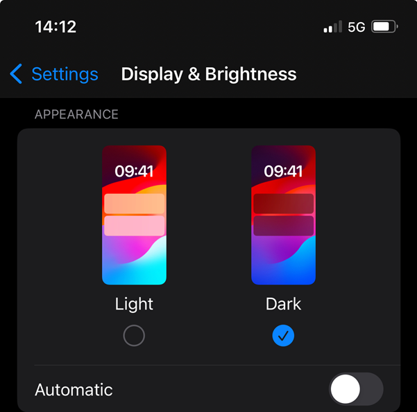
It’s well worth it to try out Dark Mode to see if it works for you. On Android, Dark Mode is easily turned on or off by going into Settings and selecting the Display option. Here, Dark Mode or Light Mode is the first choice. Similarly, iOS is easy – go to Settings, Display and likewise both Light Mode and Dark Mode are the first choice to set.
While these settings on both Android and iOS perform well across much of the phone, we still though from time to time encounter Apps that don’t display in Dark Mode if that is what we’ve set in the display settings. We jokingly refer to these as ‘disobedient’ apps, though all joking aside – this can be a royal pain for our low-vision users who really rely on Dark Mode to be able to function.
To be fair, Google and Apple cannot ‘force’ third-party app makers to implement Dark Mode when you the phone/tablet owner have set Dark Mode in the settings menu. It is up to the developers of these ‘disobedient’ apps to do it. Credit though to Google and Apple as they know it will take a long time for many app makers to get around to making their apps better.
Apple and Google have provided ‘workarounds’ that can force or override apps into Dark Mode through a feature called ‘Smart Invert’ (iOS) or ‘Colour Inversion’ (Android). Both Android and iOS have different methods which I will go through below in a moment. It is interesting to read how both go about it and to see the pros and cons of each solution. I am on the fence as to which is the best method, but Android’s workaround is the most flexible.
Android*: The solution here keeping in with Android’s “on-demand” approach to many accessibility settings provided. So, when you encounter an app or a website that just doesn’t display in dark mode, you – the user can ‘do something’ to force a change. I say, do something because Google is nice in the sense that they give you three options in the method of switching on/off their colour inversion feature.
Colour inversion as you may have guessed flips colours around! So, where you have an app or a website that is only showing a white background with black text, you can invert or flip that around. To get to this setting, go to Settings, Accessibility, and head on to Visibility Enhancements. In the list here is ‘Colour Inversion’. The trick is not to switch it on yet, instead – tap on the words colour inversion to reveal an options menu. You should now have a colour inversion shortcut option. Select this option and turn it on.
The three options for colour inversion now appear. The first one is the ‘Tap Accessibility button’ – however some users may already be using the accessibility button for features such as ‘Select-to-Speak’.
Perhaps one of the two remaining options would be better here? Those are 1) press and hold the volume up and down keys together for three seconds, or 2) press the side (power) and volume up keys together. The side and volume up keys together are probably the fastest option if you’ve already assigned the ‘Tap Accessibility button’ to do another function.
With that set, it’s now time to exit the settings and head over to the App or website that’s behaving badly! Try out the shortcut you set and put Colour Inversion into action.
Now for the Pros and Cons of Android’s solution. Pros: This setting can be switched on/off anywhere on the phone or tablet including web browsers. There are three options from which you can pick. Cons: Unfortunately, colour inversion applies to photographs – so If you need to view imagery, graphs, etc. you will be switching on and off the setting more often. Also, if you employ the buttons as your switch – it can be tough for users with dexterity issues. So, you may have to rely on the tap accessibility button option which adds another tap if you assign more than one accessibility setting.
iOS: Apple has a different approach to offering ‘smart invert’ to their users in the sense that you can set individual apps to display in smart invert mode. To do this, go into Settings and then into Accessibility. At the bottom of the Accessibility menu, there is a menu called ‘Per-App settings.’ Here you can dictate different settings each App must display. The first thing here is to see if your ‘App that’s behaving badly’ is listed. If it is not, simply select ’Add App’ and pick it from the list of all apps on your iOS device.
Once added, you are returned to the Per-App settings menu.
Now, select the App you want to adjust, and a menu will appear with many options with which you can toy. Down the list is Smart Invert and we are going to change this from ‘Default’ to ‘On’. Next, we exit Settings and head on over to the app we adjusted. Your App should now display in Dark Mode where it didn’t before!
Pros: Apple’s Smart Invert is a little ‘smarter’ than Google’s Colour Inversion because it generally does not adjust photographs. Because you’re applying the Smart Invert to ‘just that App’ there is a set-it-and-forget-it approach that is simple! Cons: The letdown is websites because if you set your browser (usually Safari) to Smart Invert, it will mess up viewing of websites that do obey Dark Mode. However, there is another option here which I will explain below.
The workaround for websites on iOS feels rather similar to Android’s solution we mentioned above. On iOS, head over to Settings and open the Accessibility settings. Down at the bottom of the menu just above the ‘Per-App Settings’ is the ‘Accessibility Shortcut’ menu. Open this and put a tick beside the ‘Smart Invert’ option. We can now triple-press the side button (power button) to turn on/off the Smart Invert when we encounter a website that we want to force Dark Mode on.
Note: iOS has ‘Classic Invert’ in the options which will ignore photographs and invert those too. It is a rarely used option though.
I hope the above guide proves useful to some of our readers. Don’t forget you can contact your local Vision Ireland technology trainer for support on any of the above settings or contact the VI Labs Helpdesk on 1800 911 110 or email [email protected].
* The Android system used in the guide above was a Samsung A71 running Android 13 – other Android phones may differ.
Sign Up For Our Technology Newsletter
Please Subscribe to our Talking Technology Podcast